
SIMPLIFYING + MODERNIZING THE DINE-IN EXPERIENCE
Panera Bread Case Study
MOBILE APP DESIGN · USER TESTING · RESEARCH

Overview
As the pandemic scare only just begins to dwindle down, food service industries face an entirely new struggle.
How can we help customers feel more comfortable dining with us again?
We found that Panera Bread, having an increasingly relevant mobile experience, was a strong contender for an app that would benefit from a case study on improving the online experience that takes place prior to arriving in-person.
TEAM
Tiffany Thai — UX Designer
Kevin Ho — UX Designer
Jordan Vargas — UX Designer
Jonathon Miko — UX Designer
William Eltosam — UX Designer
MY ROLE
Responsible for conceptualization and research, group brainstorms, and cart prototyping
TIMELINE
April - June 2022 | 10 Weeks
TOOLS
Figma, Maze, Miro, Slack, Google Forms
Video Overview
Problem Space
Upon viewing the user reviews, I found that many of the critical reviews—aside from those that criticize their in-store experience or bugs—wish for an improved menu selection experience.


Panera is highly valued for its quick grab-and-go experience that the app offers. The pandemic made this feature even more valuable for everyone, especially those who already use it.


PROBLEM STATEMENT
How can we make the Panera Bread app offer an ordering experience that provides ease and haste compared to ordering in-person while retaining the same warm café feel?

Measuring Success…
75% of survey respondents have never made a dine-in reservation. The other 25% stated that the experience was very straightforward.
The reservation process must be simple, require as few clicks as possible, and intuitive.
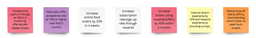
Our Key Performance Indicators (KPIs) told us what we would need to be looking out for in order to properly measure the success of our project.


We created a Customer Journey map based off of our persona to help us visualize the steps a user might take to schedule a reservation order through the Panera Bread app for a group study session.
🍞 Onto designing! 🍞

We then moved on to low fidelity prototyping:


High visibility star ratings for quick decision-making.
I began with a quick sketch of what I imagined the features could look like. Because these sketches allotted for too many clicks, my team envisioned how we could then cut them down.

Recents & Favorites for personalization.
Before beginning high-fidelity prototyping, user testing and Maze.co scenario testing for our low-fidelity prototype told us that:
Users had no issues opening the menu screen.
Some users experienced difficulty when it came to finding reviews.
Selecting a sandwich had the lowest success rate at 54.5%, suggesting a need for overhaul.
The menu icon was suggested by many users to be bigger. General split between size of icons and layout.
We realized that many users were confused on navigating through our low-fi prototype.
Only 33.3% testers were able to succeed.
Having a shopping cart icon and proceed button is important for most people.
A near-split sentiment on diagrams of store hours and open tables.
Search bar added for ease of use.
Quick view of life café status.
Multi-functional (users do not need to make a reservation)
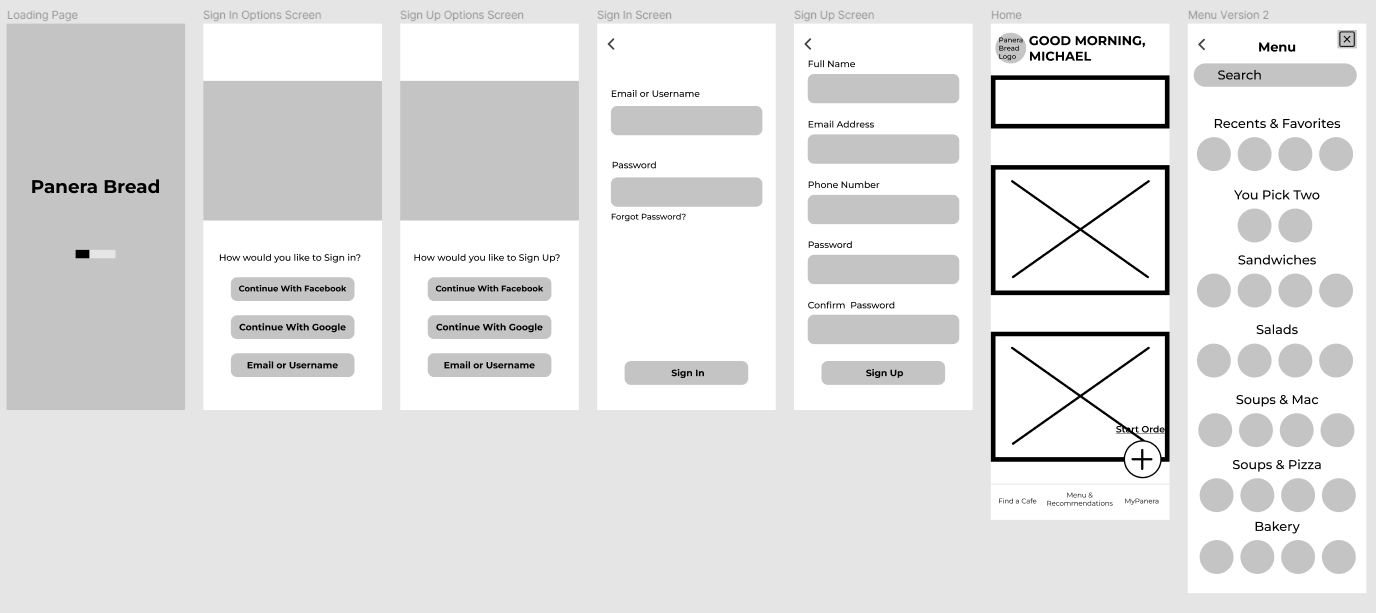
High-fidelity prototype
Upon conducting another Maze.co test of our high-fidelity prototypes, we found that the general sentiment was significantly more positive than our low-fidelity prototype tests.
80% of testers completed their tasks (compared to 33.3% for our low-fidelity tests), with only one user dropping off.

Video Overview
Final Sentiments
This project was my first experience working on a case study with a group. I learned how to use apps like Maze, Miro, and Figma collaboratively. It was difficult to plan collaborative times to work together and learn to compromise as we each had our own ideas for the project. This was especially difficult being five strangers who had just met for this project. However, as we worked together more, we learned what each of us were comfortable with and what limits we were able to push.
Given more time and fewer project constraints, I would have loved to expand on the UI of the designs. Additionally, I believe the menu page, reviews page, and reservations page could have definitely used more time and testing to increase usability.