
PROVIDING MORE OPTIONS IN A PARTIALLY FREE APP
Calm Case Study
MOBILE APP DESIGN · USER TESTING · RESEARCH
Overview
Calm is the #1 app for sleep and meditation, its largest competitor being Headspace. It aims to help people of all ages and backgrounds sleep restfully, ease anxiety and stress, and evoke calmness for any reason. It was rated app of the year by Apple in 2017.
However, a number of customers who could benefit from the services Calm offers cannot actually afford its services. A majority of the app is blocked by paywall, creating an issue for prospective users.
TEAM
Solo UX Designer
MY ROLE
Conceptualization, conducted research, created wireframes, UI/UX, prototyping
TIMELINE
August 01 – 21 2022 (3-week sprint)
TOOLS
Figma, Adobe Illustrator, Miro
Video Overview
Problem Space
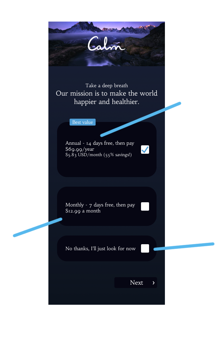
The irony of Calm — Calm is an app created for everyone, but the paywalls say otherwise. People of all ages suffer from anxiety, insomnia, and stress, but not everyone can afford to get past said paywalls. Calm offers only a 7-day free trial before charging the user $70/year to access the app. Upon download, the app can barely be accessed without inputting payment information. Compared to what the app used to be, much of the content is now blocked by paywall.
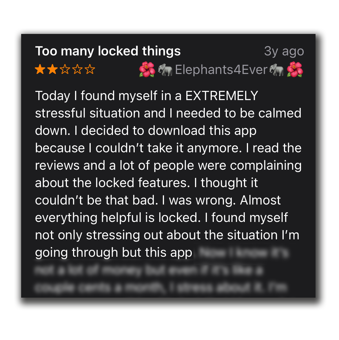
While reviews from those who can access the app are overwhelmingly positive, there is no shortfall of reviews that criticize the hefty price tag on Calm’s subscription service. I quickly found that a large number of Calm users, old and new, shared similar sentiments to my initial thoughts.


PROBLEM STATEMENT
How can we make Calm accessible to everyone who needs it but cannot necessarily afford to purchase yearly subscriptions, while still maintaining a fair price that reflects the cost to create the content that the app offers?
Looking Deeper…
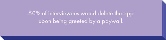
I started by conducting some user interviews to determine how and what changes can be made that would be appreciated by users but still stay within the bounds of being realistic on the company’s end.


The user interviews offered me insight into what users would appreciate, but I wanted to take a look at what Calm’s competitors were doing to know what could be better within the meditation app space. To do this, I conducted a Competitive Analysis.

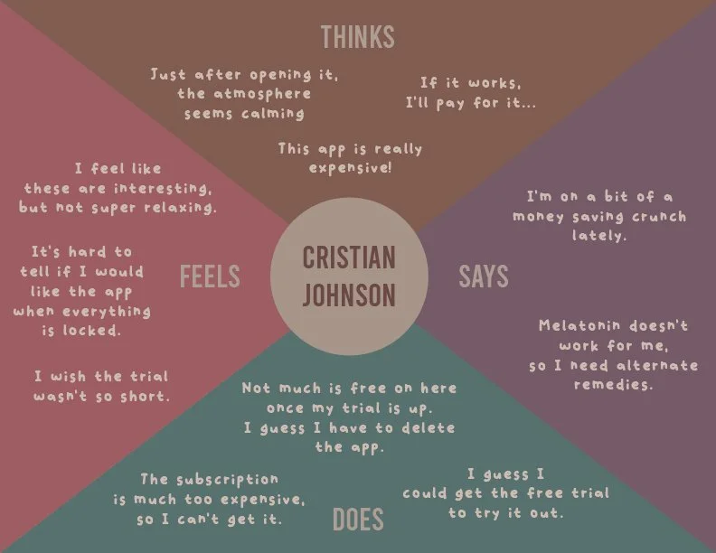
Next, to visualize Calm’s average user, I created a persona, Christian. I then created an empathy map to see what Christian might be saying, feeling, thinking, or doing before, during, and after using the Calm app.

🩺 Onto designing! 🩺
Wireframing & Prototyping
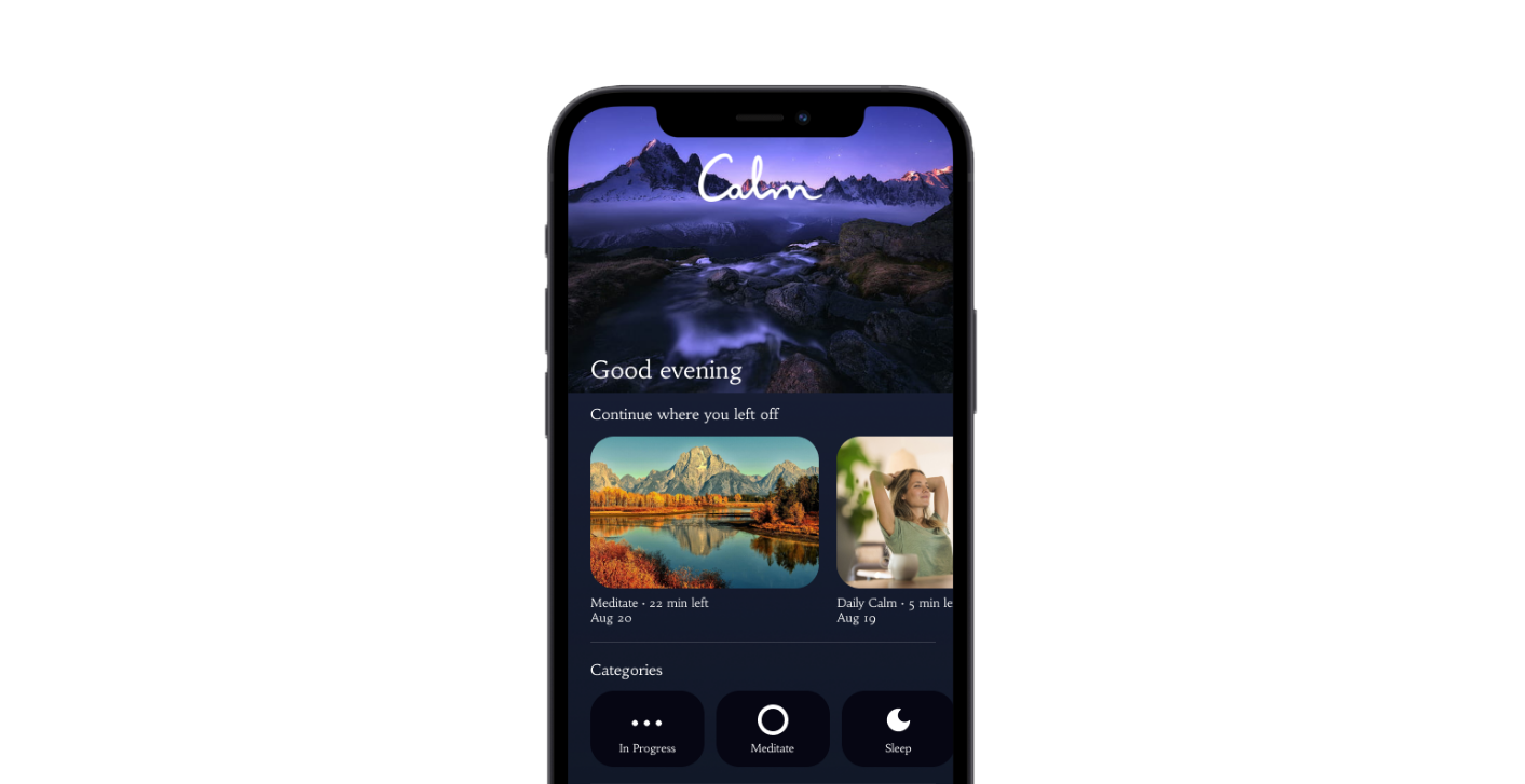
Due to the time constraints of this project, I decided to skip ahead to my high-fidelity wireframes.
The main thing I focused on for my final prototype was keeping the app affordable and usable for even those who could not afford Calm. At Calm’s current state, I feel that for many, the name and purpose of Calm is ironic—the fees may evoke stress, rather than calmness. To circumvent this, I highlighted two things in my prototype: a “free daily calm” that provides a limited amount of free lessons and meditation sessions that rotate daily, and a page where you can watch one ad per day to unlock more lessons.
After completing this project, I revisited a few months later and decided to create another screen. I felt that this screen was necessary according to my research and problem statement.
Monthly option for those who maybe cannot afford an annual subscription at the moment

A daily free mix that encourages users to log onto the app daily

14 day trial rather than 7 days
Encourages an annual subscription, but does not force the user into anything
Does not force the user to subscribe, allows a browse first option
Ads to watch content

Video Overview
Final Sentiments
If I had more time to complete this project, I would like to spend more time wireframing to refine the screens a bit more. I would also like to do more research and user testing.
I think I would like to change the primary color to a lighter blue, as I found during the research for my To-Do You! project that users find blue to be a very calming color. While Calm does use a shade of blue, I must question whether it is too dark a shade to have the same effect.